
case study
dallas
market Center
Dallas Market Center is a global trade hub where thousands of buyers and brands come together to connect, discover, and define what’s next in home, gift, lighting, and fashion. It’s not a mall or a convention center, but a five-million-square-foot city within a city.
Our task was to bring order to the scale. Six markets, six voices, one brand system that spoke clearly to both buyers and exhibitors while holding its shape across websites, wayfinding, publications, and live events.
The work was as much architecture as design—building a living framework that made Dallas Market Center feel unified, intelligent, and undeniably alive.
TEAM LEADERSHIP
CREATIVE STRATEGY
COPYWRITING
PHOTO ART DIRECTION
EDITORIAL VIDEO
VISUAL MERCHANDISING
PUBLICATION DESIGN
EXPERIENTIAL/EVENTS
context
Dallas Market Center hosts six major industries under one roof: home, gift, lighting, apparel, western, and equestrian. Each had evolved its own look, tone, and rhythm—creating a brand that felt more divided than diverse.
The challenge was scale and fragmentation. Six markets. Six voices. Twenty-four times a year. No shared design language. The goal was to bring everything into focus without losing the individuality that made each market distinct.
approach
We split the brand by audience:
buyers and exhibitors.
Two tracks. Two kinds of storytelling.
For buyers, we built campaigns that inspired discovery.
For exhibitors, tools that simplified participation.
From there, we designed a modular system—color, type, imagery, and tone—that could flex across markets and seasons while keeping a single identity intact.
solutions
We built a complete creative toolkit: brand identity, photo art direction, video, publication design, wayfinding, and event/experiential environments.
For fashion markets like Western, Equestrian, and Contemporary, we produced one photo campaign that served as a shared image bank. Three markets, one cohesive story.
Buyer and exhibitor materials were rewritten and redesigned with the same discipline: clean hierarchy, modern typography, and intuitive.
Website re-design
SPARK magazine
DESIGNERS’ GUIDE magazine
Photo editorials
Category campaigns
Market guides
Fashion shows
Wayfinding
Operational signage
Seasonal + Market visual merchandising displays
Interactive displays
Environmental design
ARTS AWARDS SHOW
Marketing brochures
Registration materials
Exhibitor Collaborations
Western & English
Sales Association
When the architecturE is strong,
the story can move freely.
apparel + Accessories
Consistency isn’t repetition.
It’s recognition.
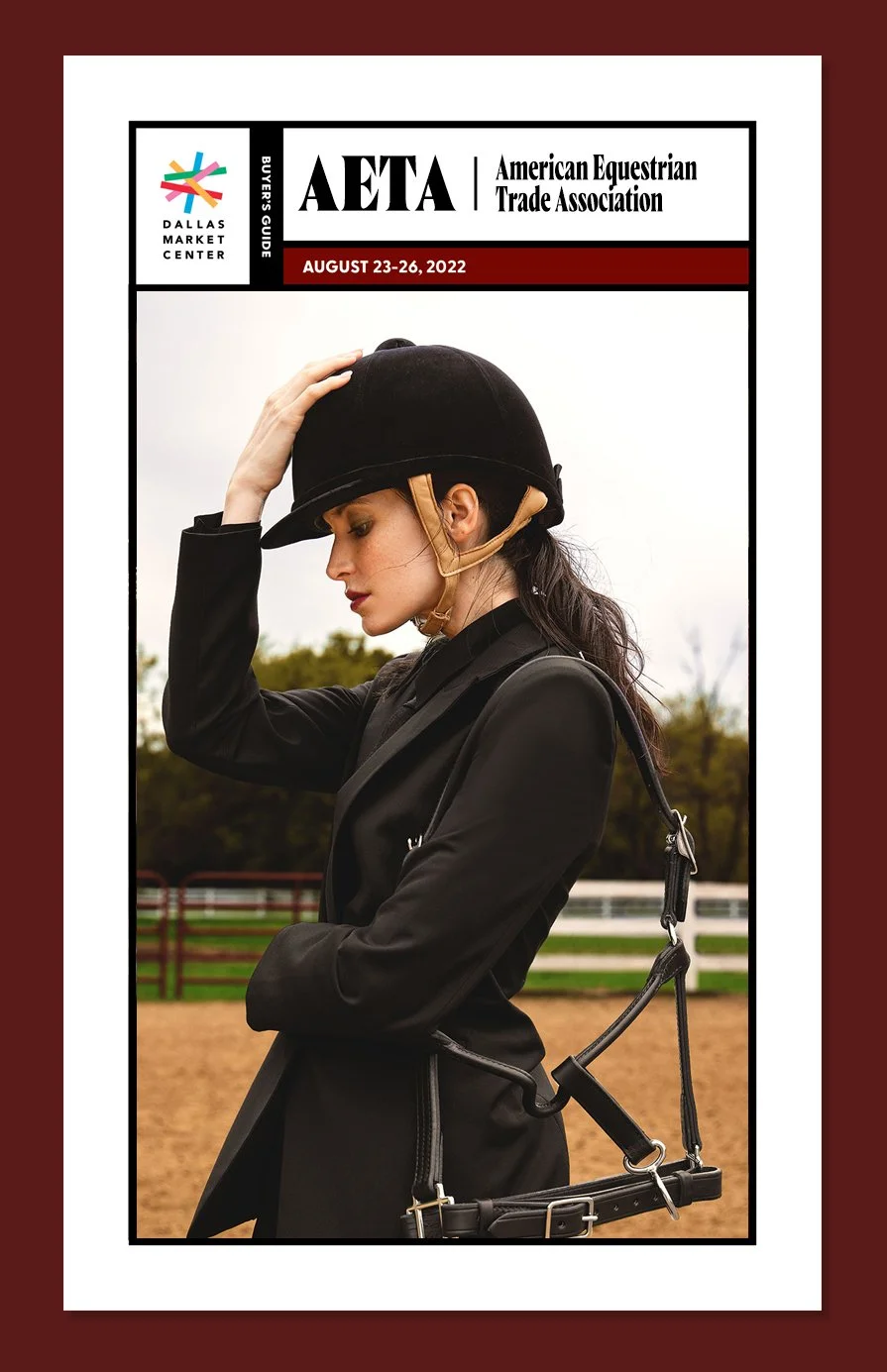
American equestrian
trade association
Consistency isn’t repetition. It’s recognition.
publications
interior + home design center
lightovation
What once felt like six separate worlds became one living brand.
The result: a marketplace that finally looked as intelligent and ambitious as the people inside it.
Consistent identity across all verticals/markets for the first time
Streamlined production cycles for campaigns and collateral
Elevated perception of DMC as a modern design authority
impact
reflection
This project taught me that design at scale is an act of translation.
You don’t erase difference—you give it a shared language.
Order isn’t about control. It’s how meaning begins.