case study
HEMPZ
TEAM LEADERSHIP
CREATIVE STRATEGY
BRANDING
COPYWRITING
RETAIL DISPLAY
PUBLICATION DESIGN
EXPERIENTIAL/EVENTS
DIGITAL/SOCIAL
A full-scale rebrand of a 15-year-old boutique body-care brand, transforming it from a niche tanning companion into a national beauty powerhouse.
Built to reimagine natural as something bold, modern, and alive, HEMPZ evolved from four scents in a handful of salons to a 60-product portfolio stocked at ULTA, CVS, Target, Kohl‘s, and Walmart. The goal was simple but seismic: prove that a botanical brand could compete at scale without losing its soul.
context
HEMPZ had existed for 15 years as a companion to tanning salons—a fading industry. The challenge was to transform a niche brand into a major retail player without losing its botanical roots. This was my most ambitious commercial repositioning to date: evolving HEMPZ from a tanning accessory into a leading body-care brand carried by global retailers.
APPROACH
The goal was to reposition HEMPZ as vibrant, fashionable, and culturally fluent, without resorting to clichés of “natural” branding.
We began with a mood board that broke the “brown cardboard” stereotype of natural brands and replaced it with an exuberant color story. We mixed earth and irony: botanical beauty, natural but never naïve.
Our visual and conceptual inspiration drew from Gucci’s new maximalist era and Vetements’ unexpected color combinations, creating a look that was whimsical yet sophisticated.
Campaigns + Tone of Voice:
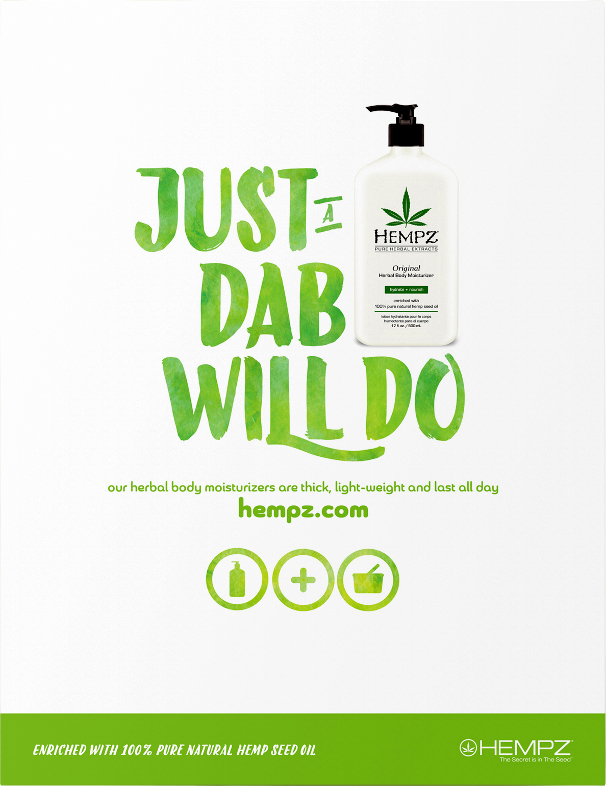
Our launch campaign introduced three headlines
“Our Lotion is Dope,”
“Just a Dab Will Do,”
“Put the Lotion in the Basket.”
Irreverent, witty, and visually fluid, these ads mirrored the product’s moisture-driven appeal through watercolor effects. Humor became part of our signature.
Product Knowledge + Sales Enablement:
Created an in-depth Product Knowledge Book—part education, part editorial—to help sales teams, salon owners, and retail buyers connect ingredients to benefits.
Display + Retail Integration:
Designed modular, pre-built salon displays with shelf strips, product signage, and educational inserts—allowing even small stockists to present the brand with polish and consistency.
solutions
Every creative decision: catalogues, packaging, campaigns, displays, and photography—reinforced that natural could still feel premium, modern, and alive.
We built a comprehensive creative system that scaled across product development, retail, and communications.
Product Lines:
We expanded into three families:
Core Line: Bright, saturated bottles and unretouched photography.
Clean Line: Transparent formulas for fragrance-sensitive consumers.
Luxury Line: White bottles, minimal design, and premium ingredients
Trade Shows + Environmental Design:
Translating this visual system into portable pop-ups, banners, and tear pads ensured brand coherence across events. Each booth told a color story while staying light, modular, and travel-ready.
Promotional Cycles:
Every two months, we launched trend-responsive limited collections inspired by fashion and film.
Each line reinforced HEMPZ’s agility and pop-cultural awareness.
impact
When I joined HEMPZ as the Associate Creative Director annual revenue hovered around $5 million. Within five years, it surpassed $45M.
HEMPZ transitioned from boutique salons to national retailers, proving that a natural brand didn’t need to look neutral. We achieved consistent brand visibility and consumer excitement through rhythm, wit, and fearless use of color.
reflection
This project taught me that precision and playfulness can coexist. Where Funimation had honed my storytelling instincts, HEMPZ taught me scalability—how to balance beauty with business, art with retail strategy.
It was the perfect collision of creativity and commerce, and the first time I truly saw design move the needle at scale.