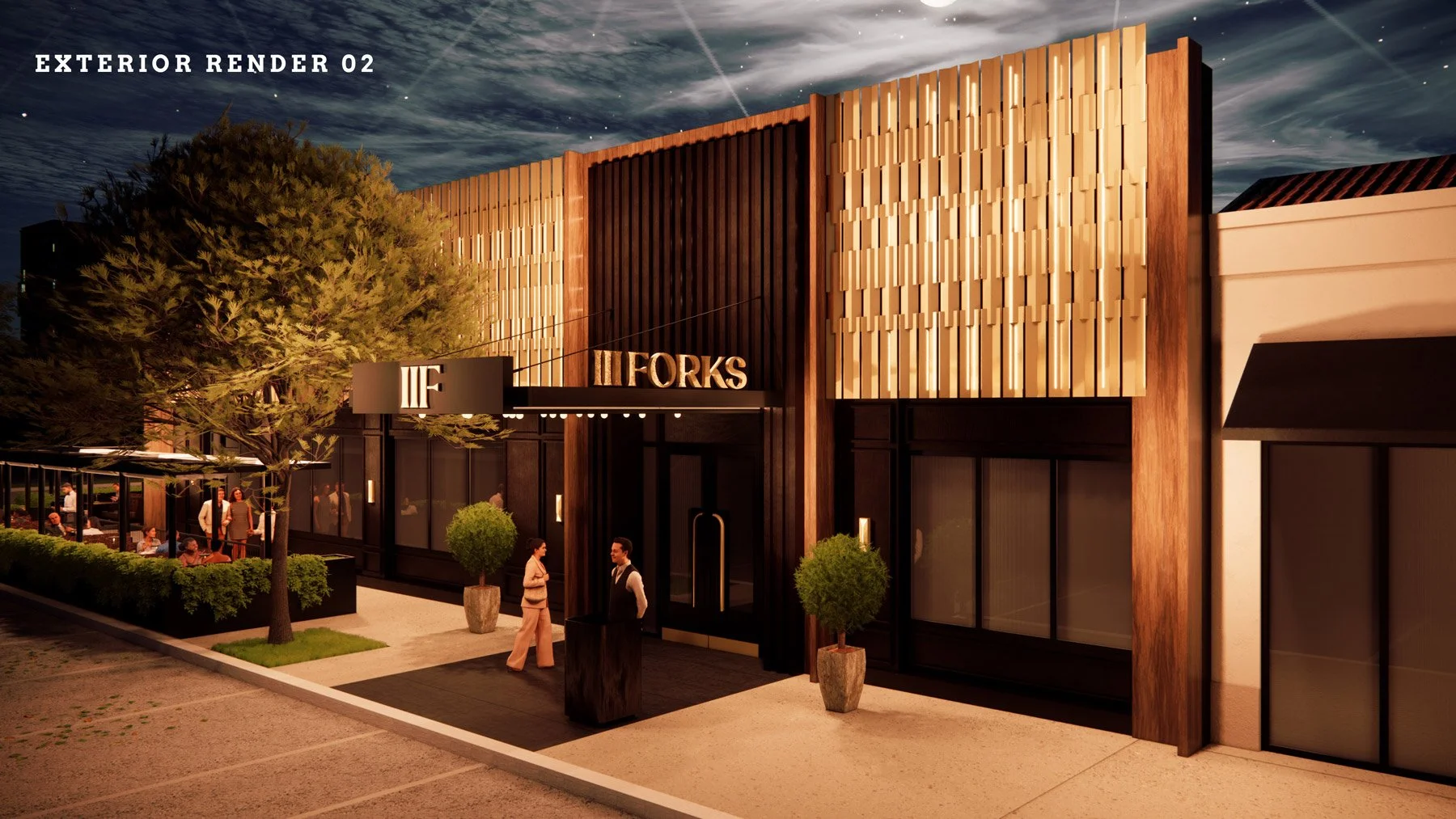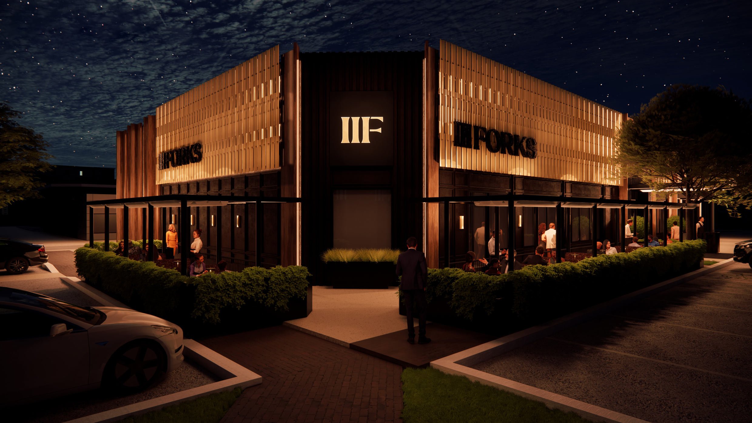
Nighttime exterior view of a modern restaurant building with large windows and outdoor seating. The building has a black and wood facade with a lit sign that reads 'ILFORKS.' People are sitting and standing outside, and cars are parked in the lot. The night sky is visible with stars.

case study

III
FORKS

A complete reimagining of a Dallas dining legend.

After more than 25 years, III Forks—once a 20,000 sq ft monument of stained glass, marble, and grandeur—was ready to evolve. The new Addison location required not just a new address, but a new idea: a modern Texas steakhouse built on intimacy, craft, and story.

As lead strategist, I worked directly with President Curtis Osmond and our internal team to define that new identity through a full-day brand workshop. Together, we reframed III Forks not as a departure from legacy, but as its continuation—refined, grounded, and alive.

BRAND STRATEGY
CREATIVE STRATEGY
IDENTITY BRANDING
INTERIOR BRANDING

WAYFINDING
DIGITAL
ART PRODUCTION
TABLETOP CURATION

context

III Forks had become a Dallas institution known for large-scale opulence—chandeliers, vaulted ceilings, oversized portions, and long business dinners.

Over time, the experience began to feel static: the old grandeur no longer matched the expectations of a younger, design-savvy audience.

The challenge was to preserve the heritage of a beloved brand while shedding the heaviness that made it feel out of step. The move from its castle-like original home to a smaller Addison footprint created an opportunity to redefine what a Texas steakhouse could be: confident, intimate, and rooted in place.
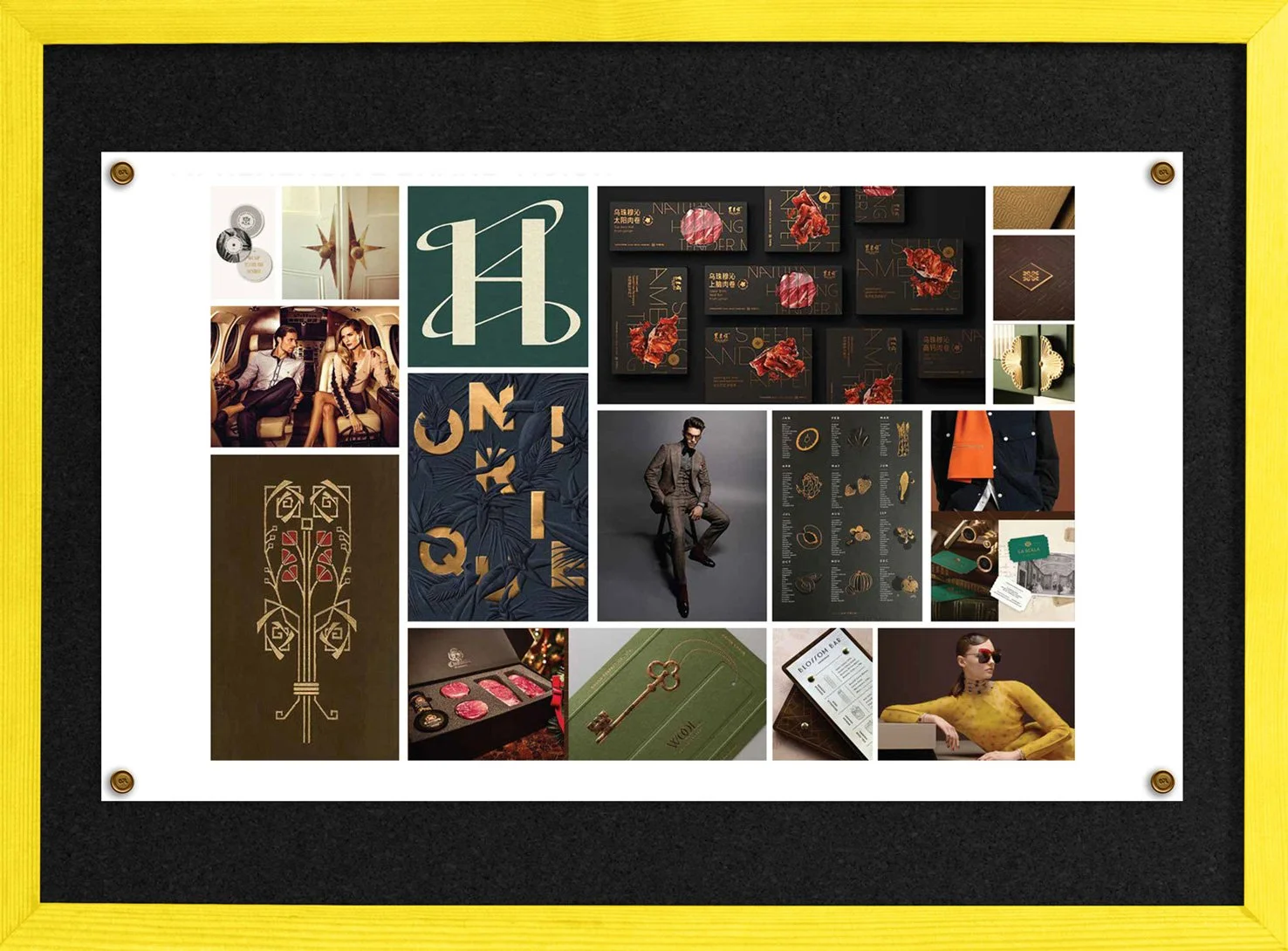
A collage of luxury fashion and lifestyle images featuring models, jewelry, packaging, and promotional materials, all framed with a yellow border.

APPROACH

Our approach began with a workshop and audit structured around a guiding truth:

Disappointment lies between expectation and execution.

The strategy was to reduce that distance. Through collaborative sessions, we gathered inspiration from the Trinity River, not through literal waves or water motifs, but through the lands it nourishes.

Comprehensive Questionnaire Feedback excerpt

  • What magic do you bring to the party?

  • What do you want your legacy to be?

  • Who’s your muse?

  • What is the elevator pitch?

  • What makes you unique?

  • What are your signature dishes?

  • What’s your story? Reason for being?

  • Create lasting memories – reason to come back?

  • What’s unique about you?

  • What separates you from the others in the market?

  • Describe your customer?

  • Is your actual realized customer your designed target customer?

  • What’s your dream customer? 

  • What is the preferred guest experience that you want to capture from start to finish

  • How much of the community and celebrating artists would you like to localize from the neighborhood?

  • What does success mean for you on this project and other stakeholders on this project?
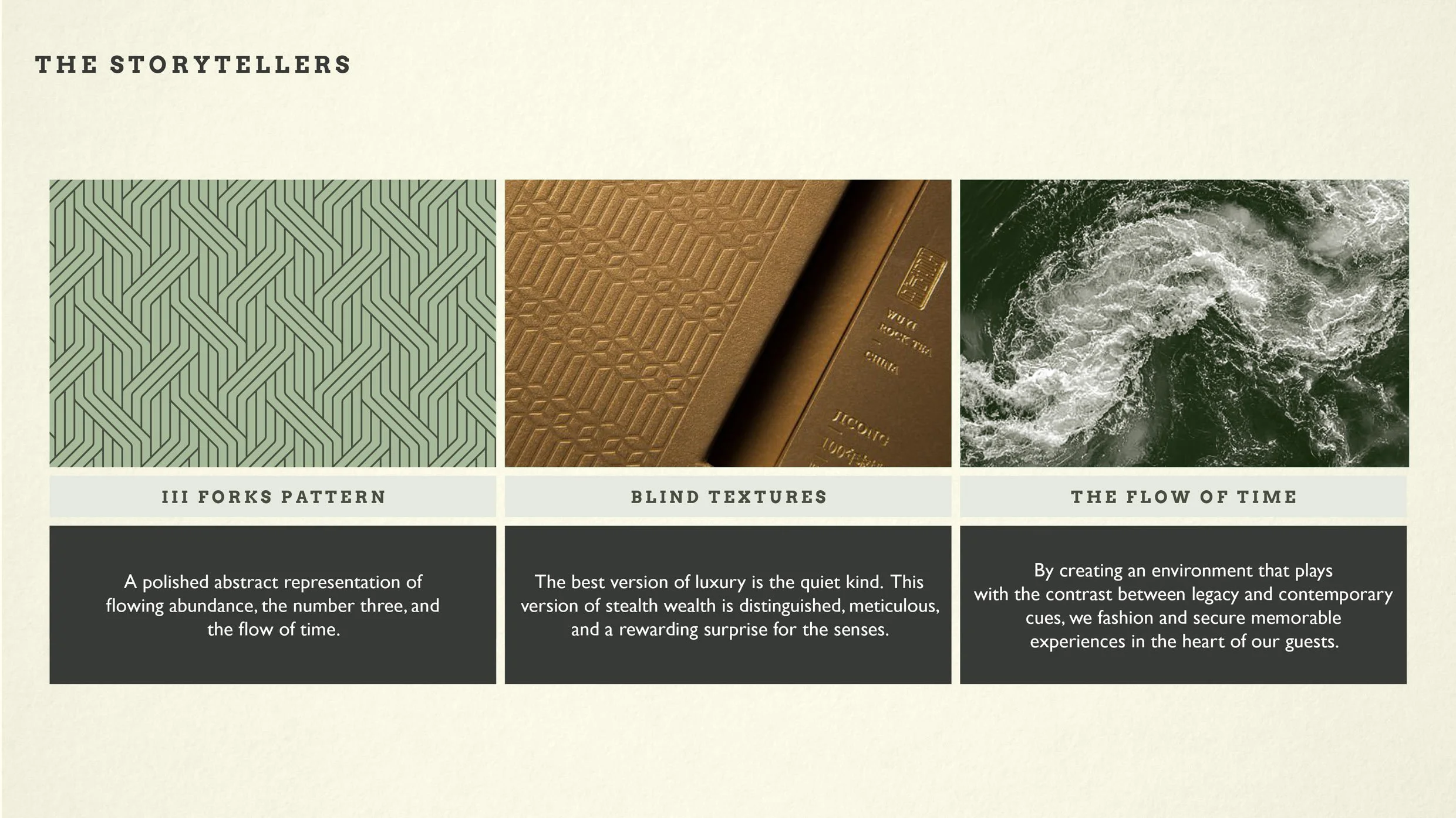
A design layout titled "The Storytellers" with three visual sections: the first showing a green pattern labeled "III Forks Pattern," the second depicting a close-up of textured brown book covers labeled "Blind Textures," and the third featuring an aerial view of turbulent ocean waters labeled "The Flow of Time." Below each section, there are descriptive texts elaborating on each theme.
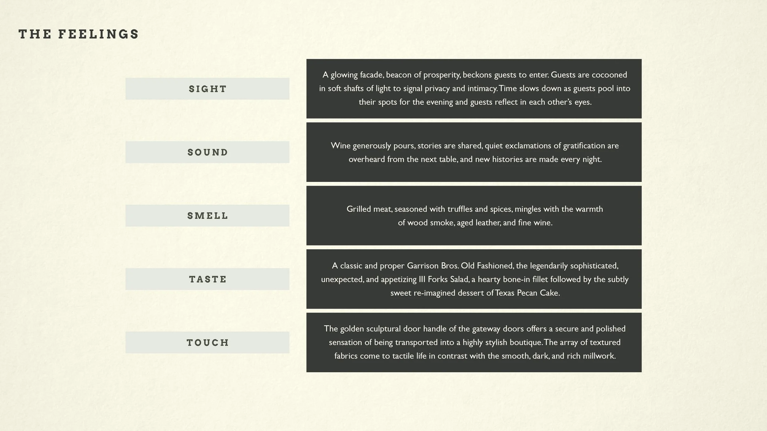
An infographic titled 'The Feelings' listing senses: Sight, Sound, Smell, Taste, Touch. Each sense is accompanied by descriptive text.
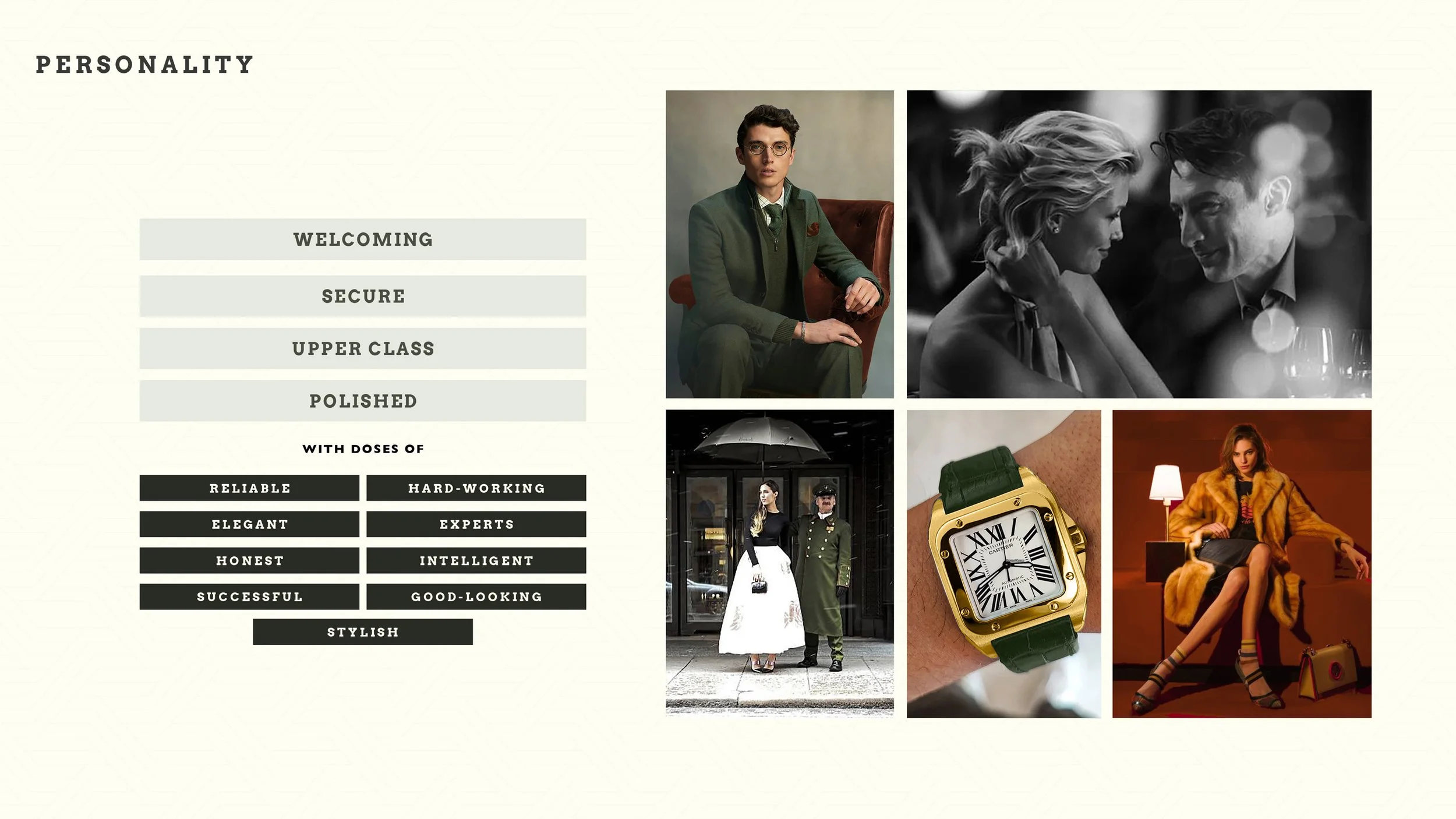
Fashion collage with photos of people wearing elegant clothing and accessories, including a man in a green suit, a woman in a yellow fur coat, and a woman in a white dress with a black coat, alongside a watch and a woman at a dinner table.
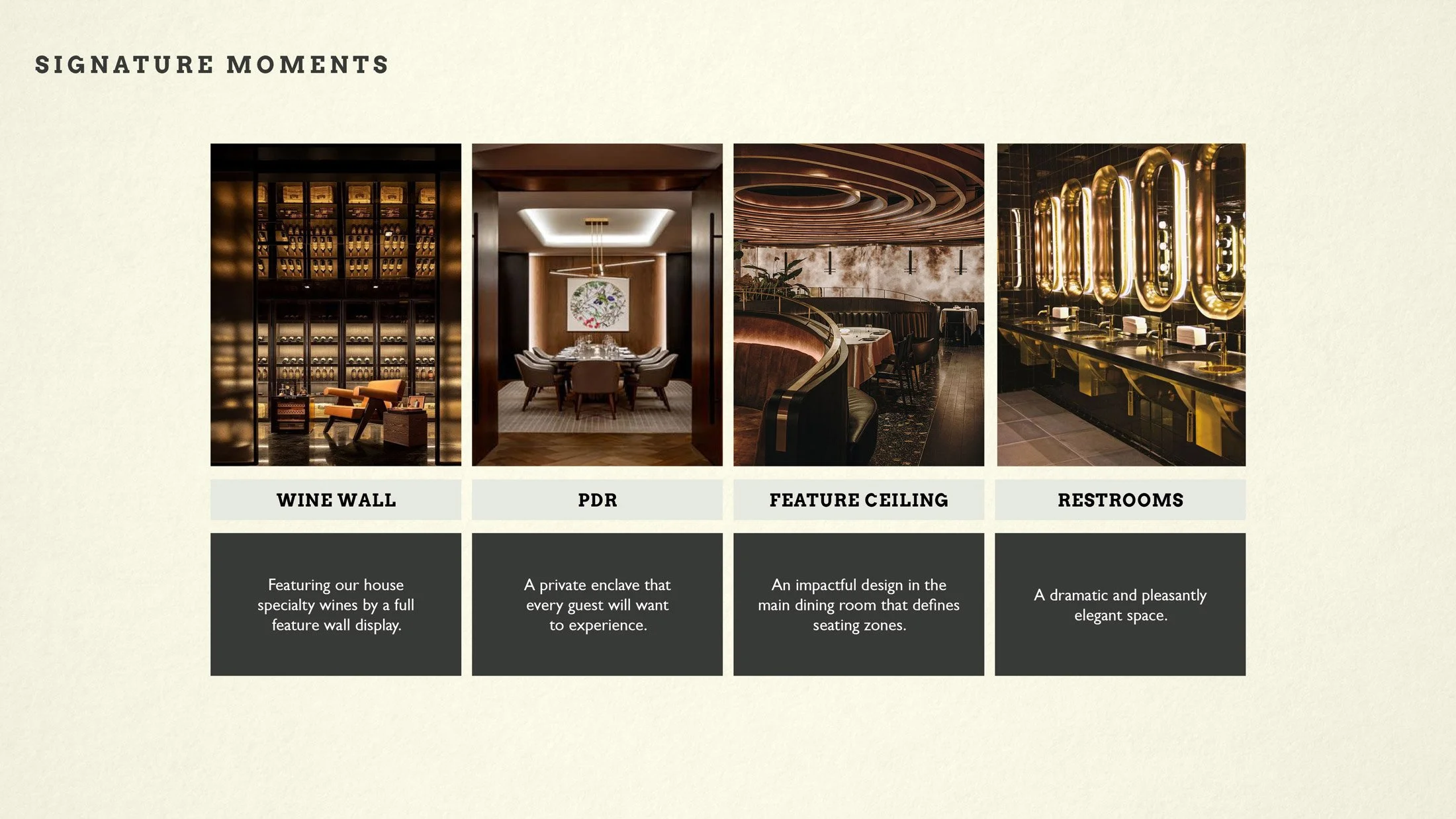
Four images of restaurant interior design, each labeled: Wine Wall with a dark wall display of wine bottles and seating area; PDR with a private dining room with a round table and artwork; Feature Ceiling with a curved wooden ceiling design in a dining space; Restrooms with gold accents, mirrors, and sinks. Descriptions beneath each include: Wine Wall - "Featuring our house specialty wines by a full feature wall display."; PDR - "A private enclave that every guest will want to experience."; Feature Ceiling - "An impactful design in the main dining room that defines seating zones."; Restrooms - "A dramatic and pleasantly elegant space."
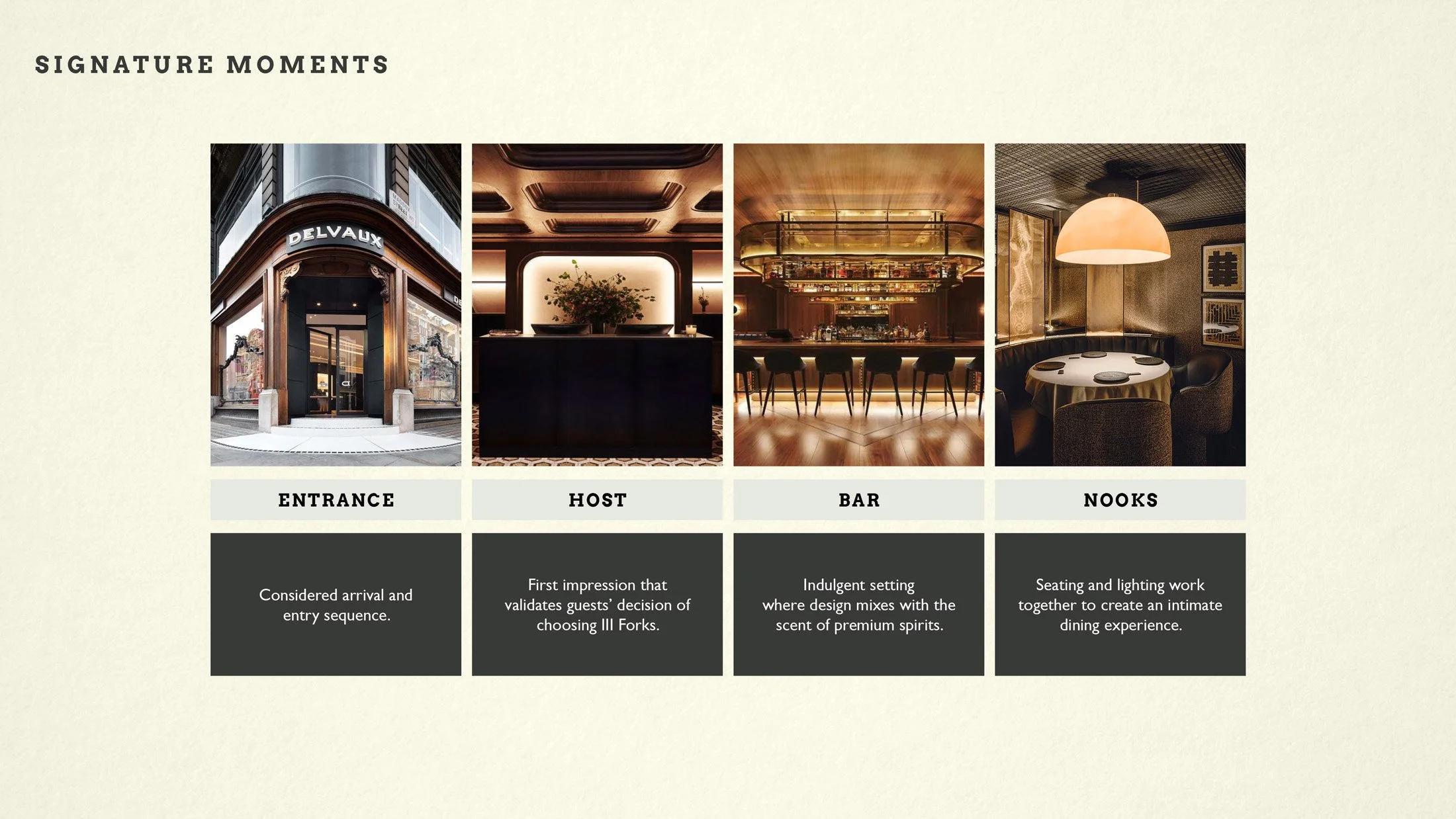
A graphic with four images labeled Entrance, Host, Bar, and Nooks, each with descriptive text below. The entrance photo shows a building facade with the word 'Delvaux' on it. The host area image shows a dark reception desk with floral decoration. The bar has a warm, inviting interior with a bar counter and seating. The nooks image shows a cozy dining area with a round table, chairs, and a large hanging light.
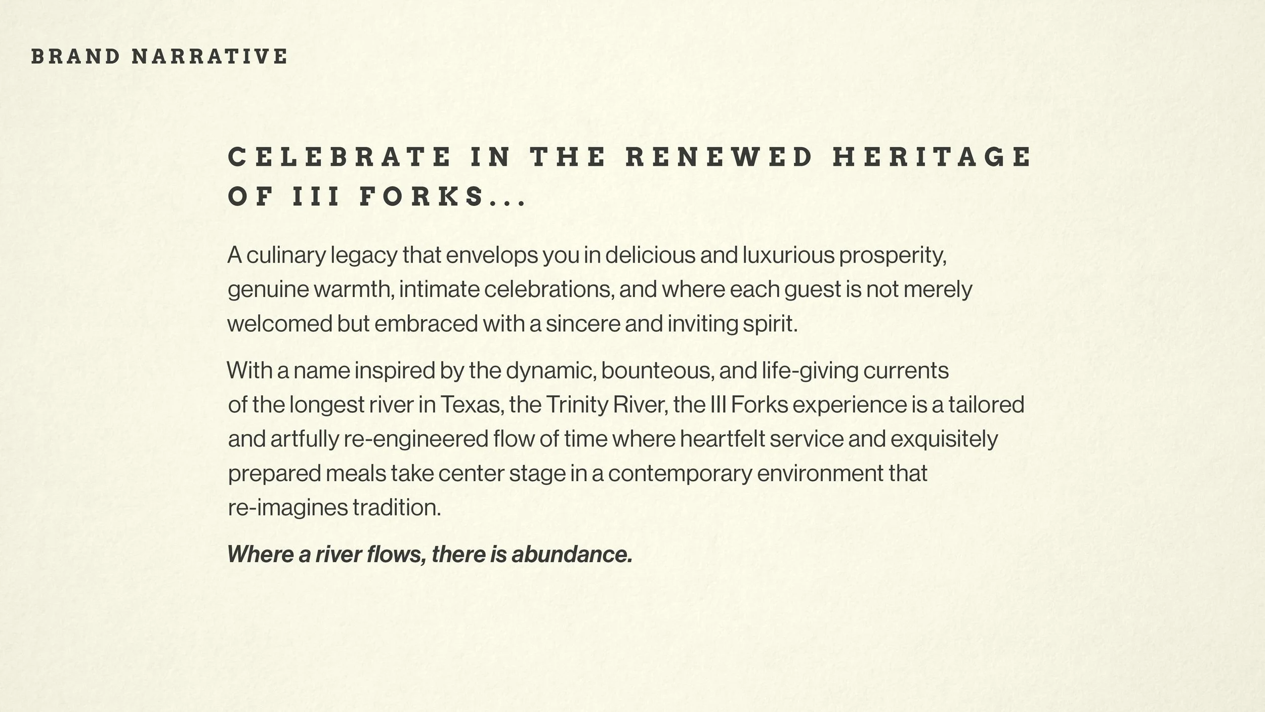
A beige page with black text about a culinary heritage and the Trinity River in Texas, titled 'Brand Narrative' and 'Celebrate in the renewed heritage of III Forks'.
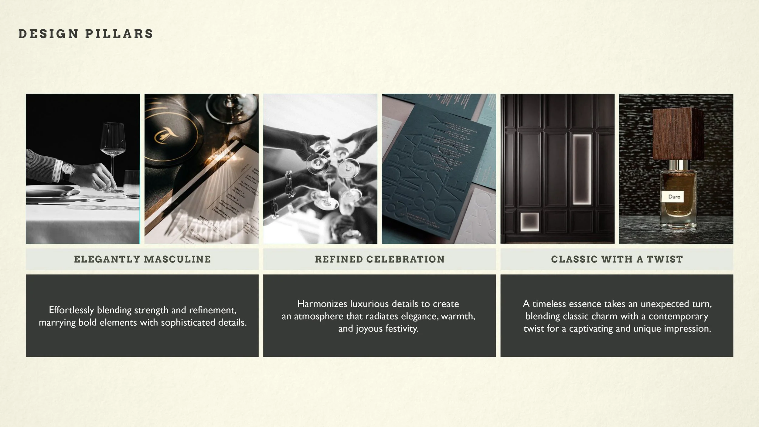
Design pillars infographic with seven images and descriptions. From left to right: a person setting a wine glass, a close-up of a plate and wine glass, people toasting with wine glasses, a menu and documents, a dark interior wall with panels, and a bottle of Duro perfume with a wood cap.
Black background with gold text reading 'FORKS PRIME STEAKHOUSE EST. 1998'.
Minimalist brand icon with the Roman numeral IIIF in black on a cream background, labeled as 'BRAND ICON' in the top left corner.
Image with the text 'SECONDARY LOGO' at the top left corner and the word 'FORKS' in bold, black font in the center, with some mirrored or reversed characters.

Color + Material Palette:

The color and material palette drew from Texas soil and terrain: the clay rust of riverbanks, the deep greens of willows, the metallic gleam of bridge steel at sunset. This framework grounded the identity in authenticity and texture rather than theme.

Inspired by the landscapes along the Trinity, we developed a palette of Prosperity Green, burnished brass, rust clay, deep wood, and matte black. The mix reflects Texas’s duality—elegant yet unpretentious, rugged yet refined.
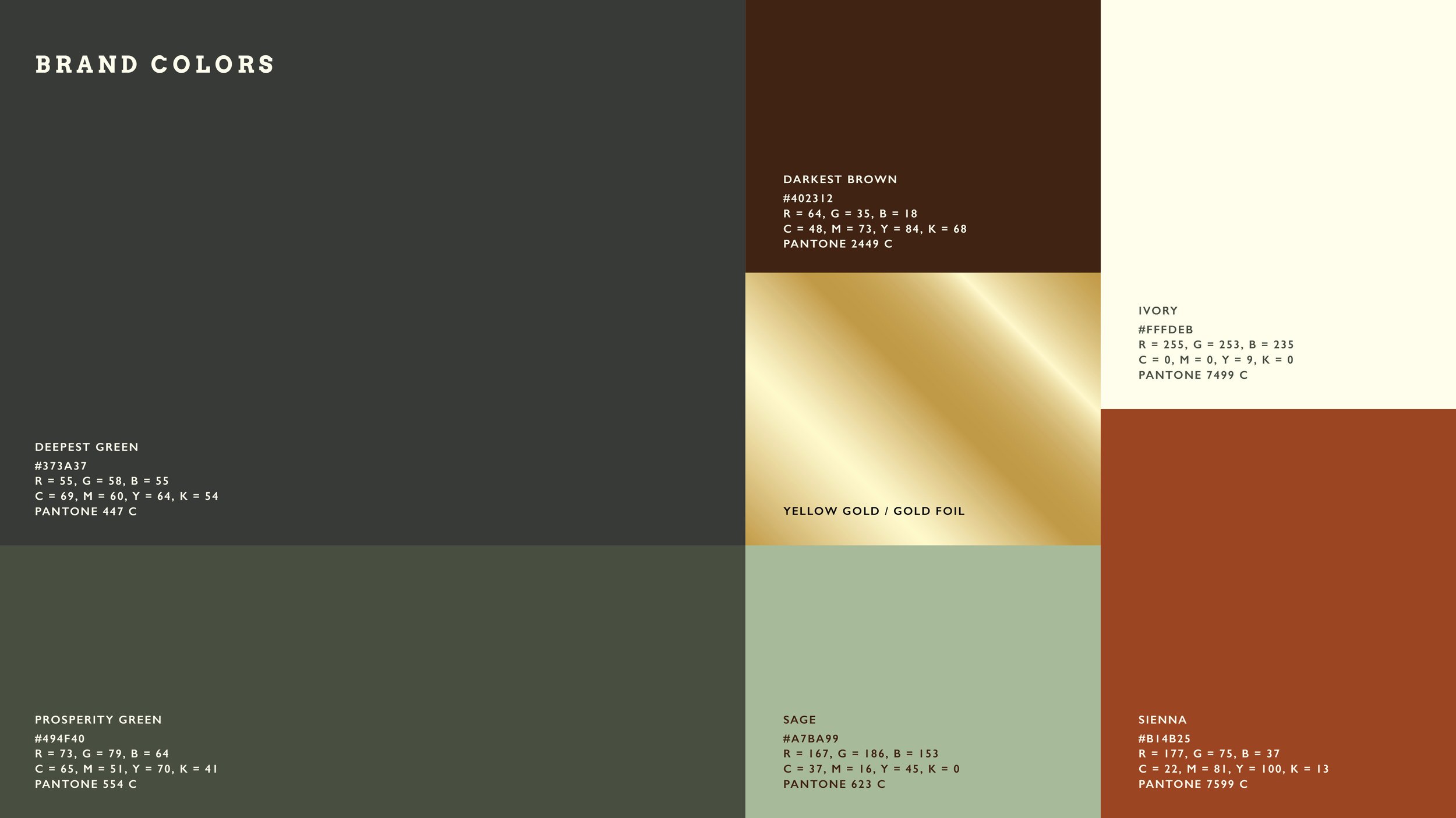
A color palette chart with labeled swatches, including dark brown, ivory, yellow gold/gold foil, sage, sienna, prosperity green, and deepest green, each with color codes and Pantone references.
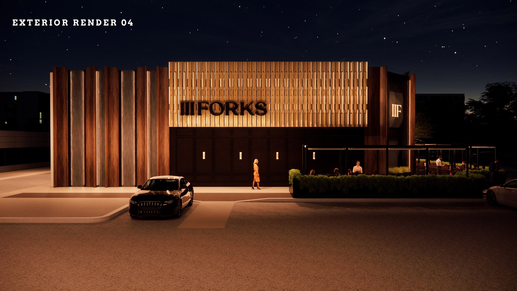
Night view of a modern restaurant with a wooden exterior facade, illuminated signage, and outdoor seating area. Car parked in front, with a woman walking nearby. The restaurant's name appears to be 'II Forks'.
Nighttime exterior rendering of a modern restaurant with wooden and black facade, illuminated signs, people entering and dining outside, trees, potted plants, and a textured sky.

Brand Identity & Visual Language:

We redesigned the logotype and identity system to express refined masculinity—strength without spectacle. A stacked three-metal motif, abstracting the “forks” of the Trinity, became a sculptural and architectural element in signage and interiors.

solutions

Interior Design & Experience:

Working alongside our interior design partners, we reduced the footprint from 20,000 sq ft to 6,000 sq ft, creating an atmosphere of craft and intimacy. Textured surfaces, layered lighting, and a 1,200-bottle wine wall became focal points—less about scale, more about experience.

Guest Touchpoints:

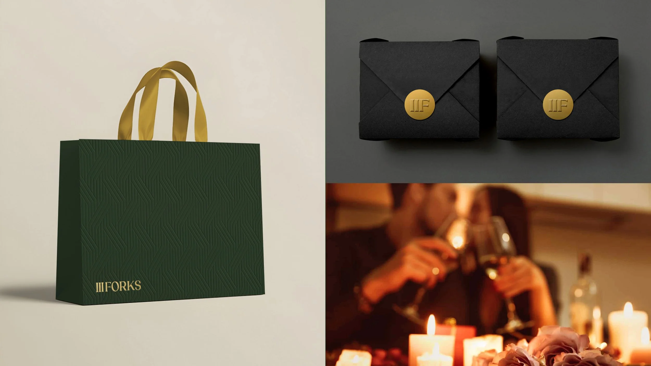
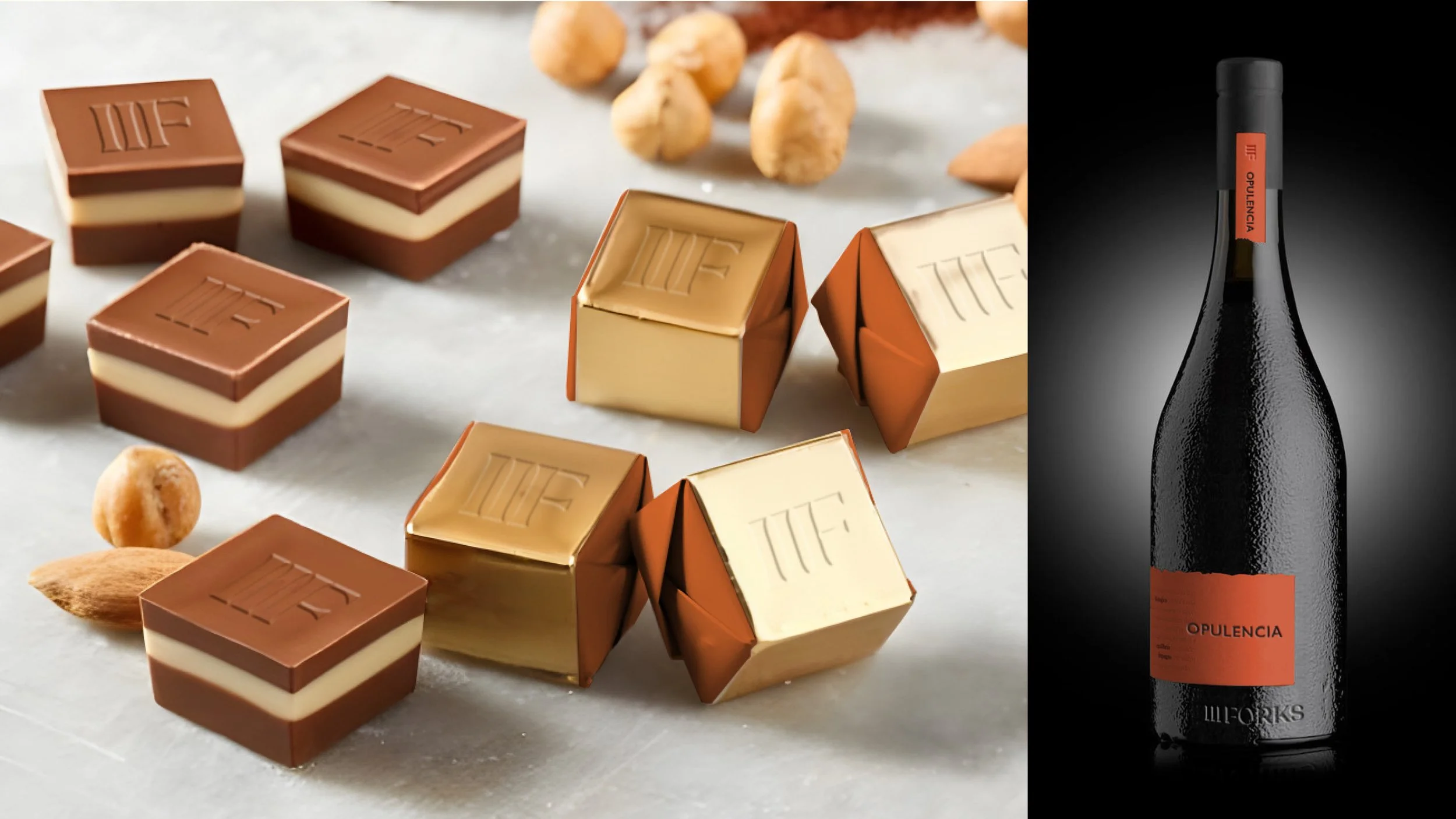
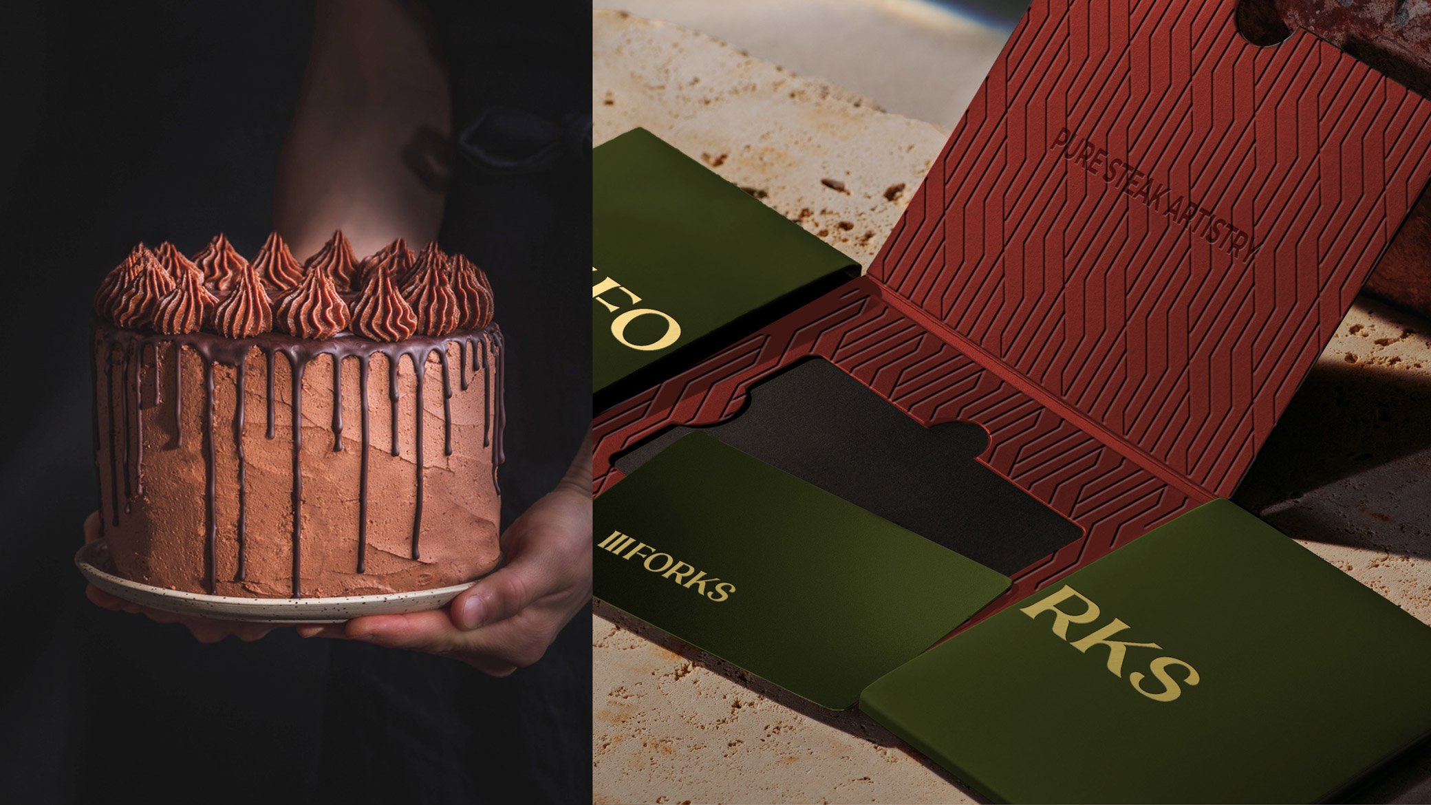
Every surface was designed to participate in the brand story—from the host stand and private dining rooms to the packaging, to-go bags, and custom chocolates.

The goal: make the brand felt before the first course arrives.
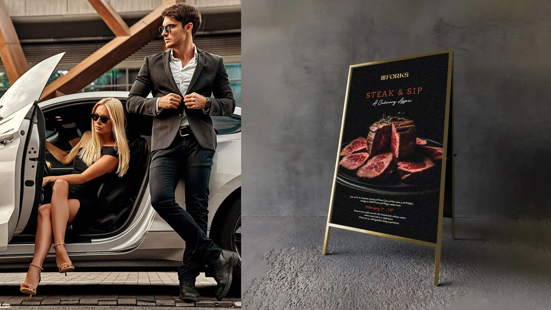
A fashionable man in a black suit and sunglasses stands next to a woman in a black dress and sunglasses sitting in a luxury car with the car door open, and a signboard promoting a steak and sip event with an image of raw beef on a dark background.
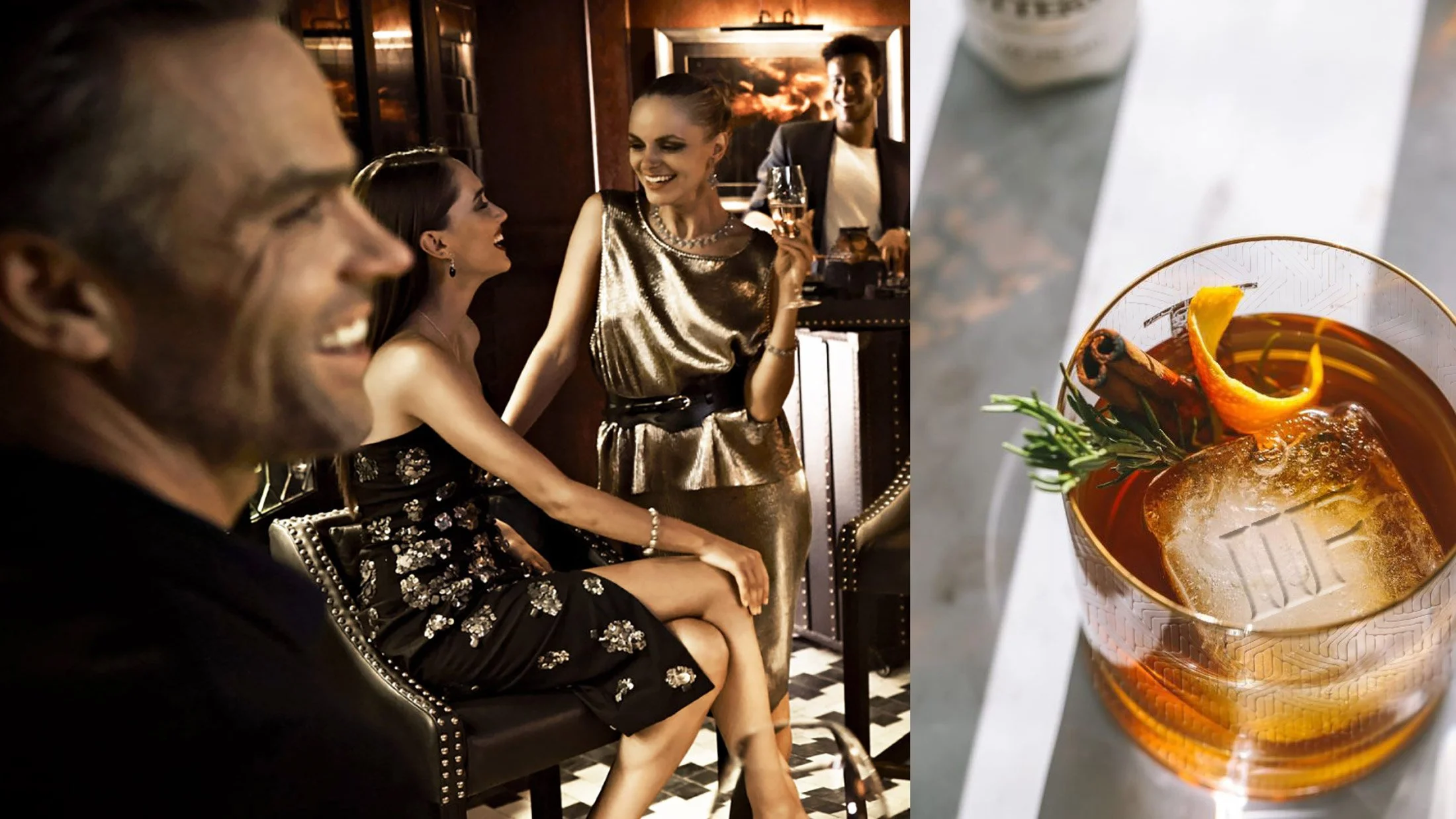
People enjoying cocktails at a party, with a woman in a shiny gold dress smiling and holding a drink, while a man and another woman sit nearby. A close-up of a stirred drink with ice, orange peel, and herbs on a table.
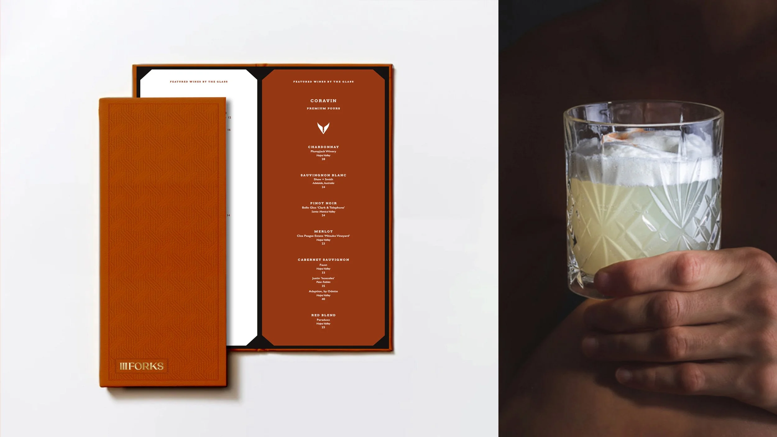
A whiskey glass with a crisscross pattern holding a pale yellow cocktail with ice, held by a person's hand against a dark background.
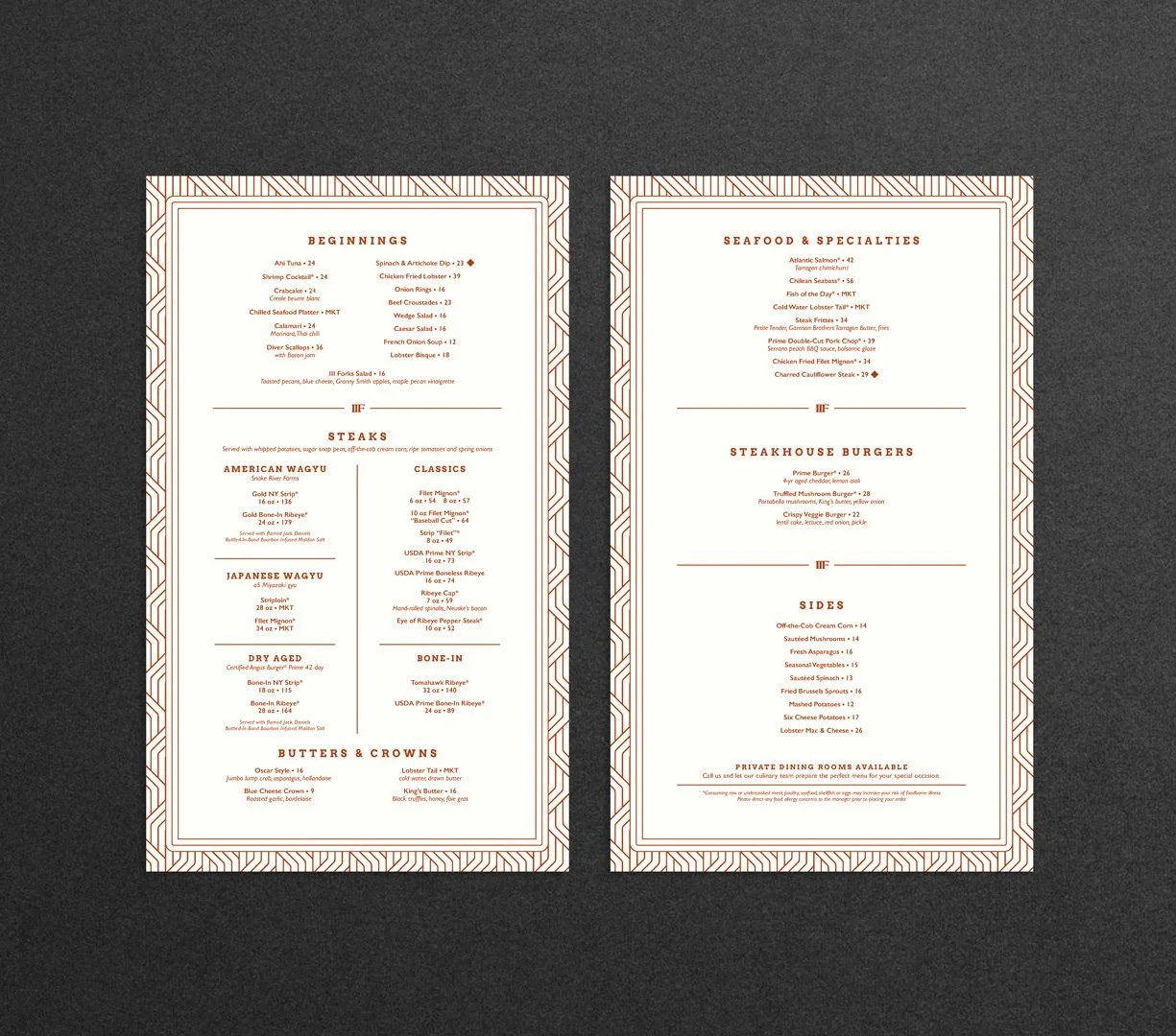
Two restaurant menus side by side on a dark background.
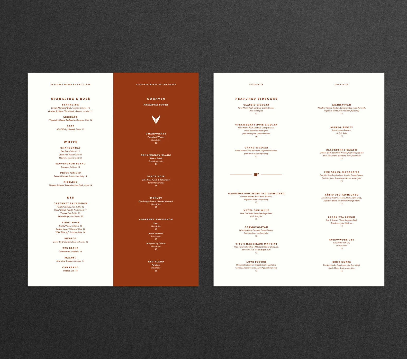
Two menus on a black background, one features wine options and the other cocktail options, with sections for different types of drinks and prices.
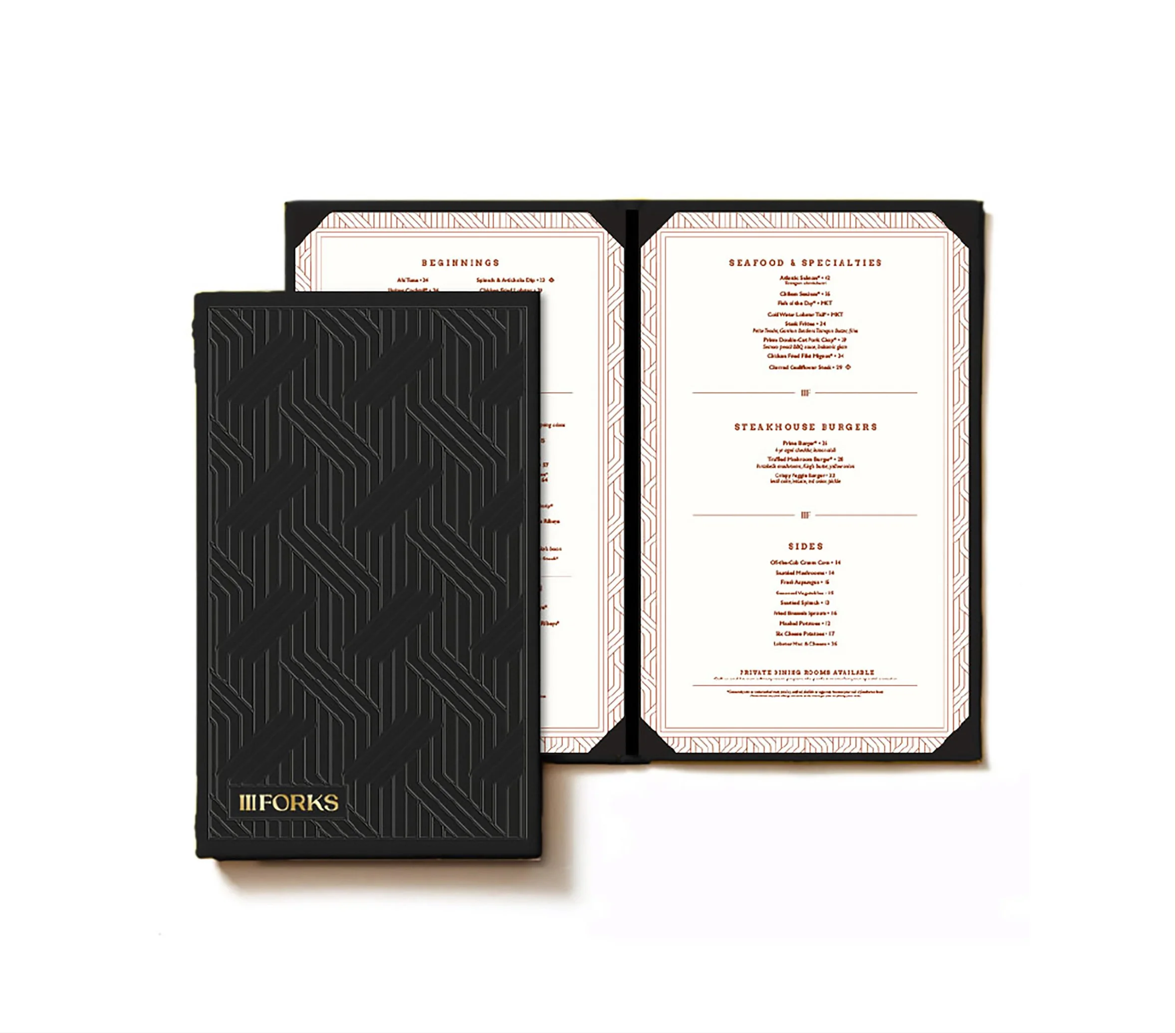
Black menu cover with geometric pattern and gold label that reads '3 Forks'; opened menu showing sections for starters, seafood, steakhouse burgers, sides, and private dining rooms on white pages with red text and decorative borders.
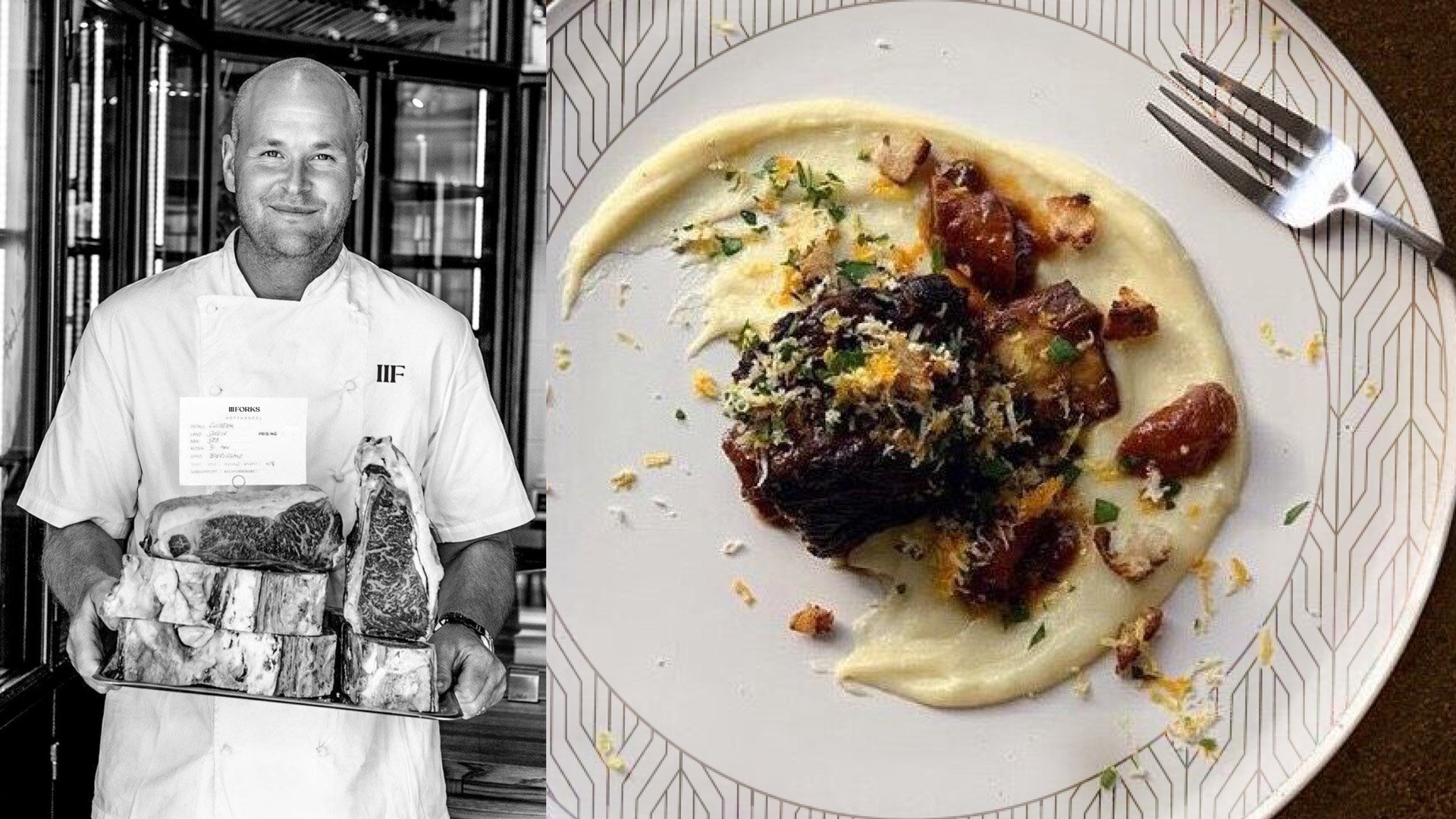
Black and white photo of a chef in a white uniform holding a tray of various cuts of raw meat, standing in a kitchen. Next to the chef, there is a plate of food with creamy sauce, meat, and garnishes, with a fork placed on the side.
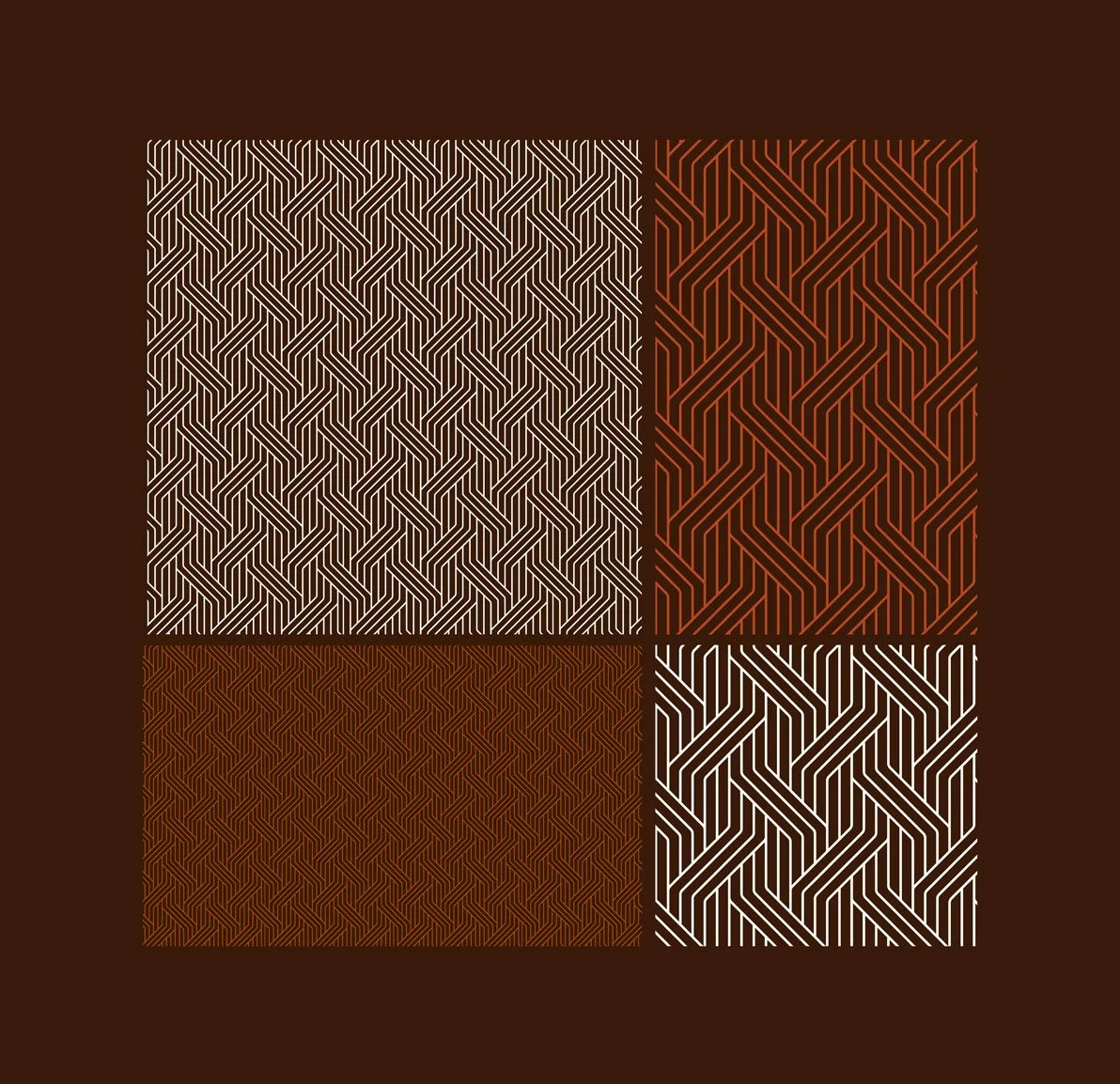
Four squares with geometric line patterns in white, brown, and red colors on a dark brown background.
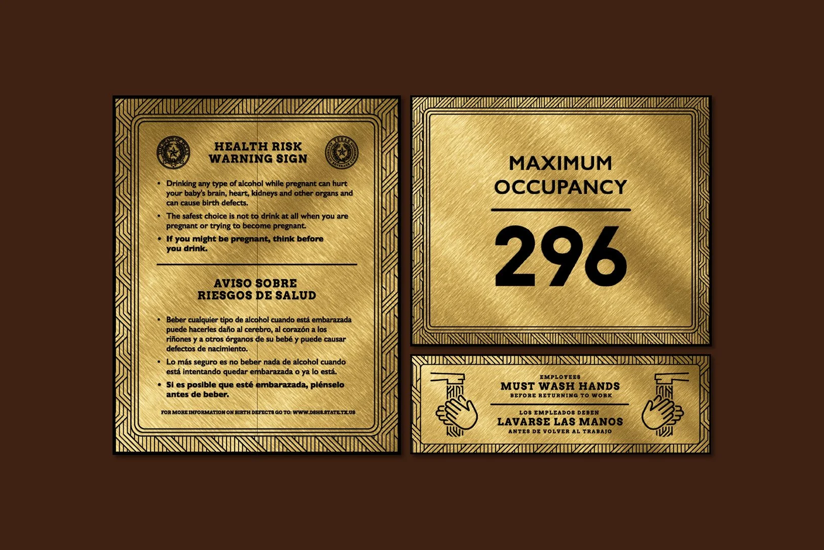
COVID-19 safety signs with health risk warnings, maximum occupancy limit, and hand washing instructions in English and Spanish, on a brown background.
A green shopping bag with yellow handles and the word 'FORKS' in gold letters, two black boxes with gold seal stamps, and a woman with dark hair sipping wine at a candlelit dinner table.
Assorted assorted chocolates and a bottle of red wine against a dark background.
A person holding a chocolate cake with piped frosting and chocolate drizzles on top, next to an open box of RICKS chocolate bars.
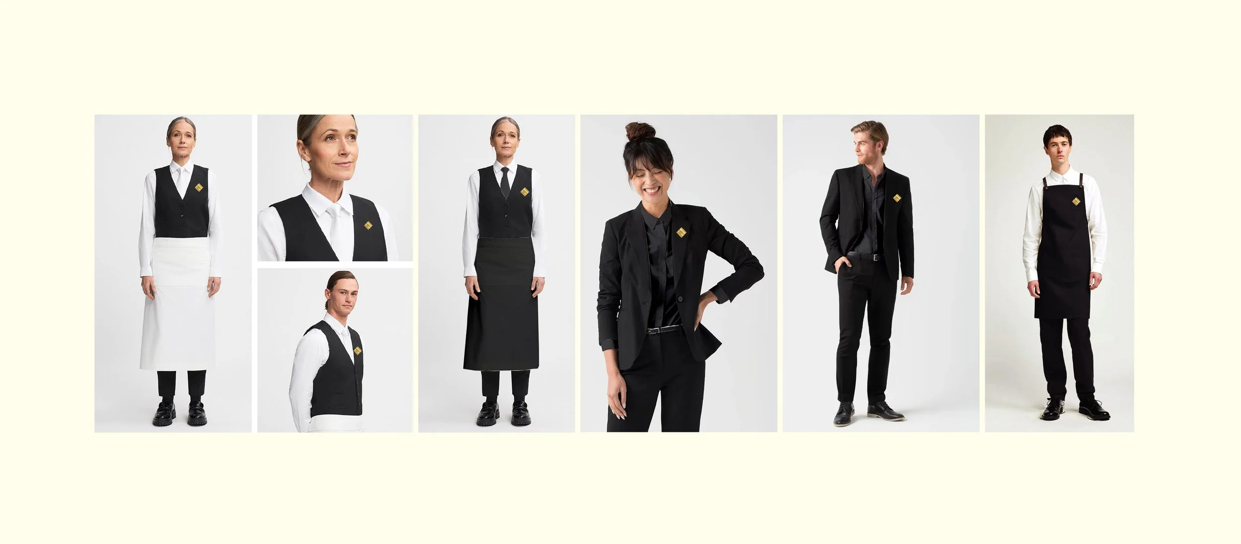
Collection of different waitstaff uniforms for men and women, including vests, aprons, and suits, displayed on models against a plain background.

“We wanted to establish something new and interesting,”

CURTIS OSMOND, PRESIDENT

impact

The new III Forks opened in April 2025, marking a rebirth of a Dallas legacy. The brand transitioned from steakhouse for show to steakhouse for now—a confident, localized experience appealing to both long-time patrons and a new generation of diners.

As President Curtis Osmond said, “We want III Forks to be relevant and meaningful to each successive generation, from Baby Boomers to Gen Z, and beyond.”

The project has already set a new standard for what legacy dining can look and feel like in Texas.

reflection

This project was an exercise in balance—honoring history without inheriting its weight.

Leading strategy for III Forks reinforced that evolution doesn’t mean erasure; it means editing. The new brand is proof that modern Texas design can be both rooted and restless, grounded in the land but open to change. The river runs, but the land endures.